Slipping Up
February 27th, 2010
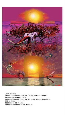
The Artist of the Month of February is John Russell, as selected by Performa curator Mark Beasley. His inkjet print on metallic silver polyester is a kitschedelic fantasy vignette called Untitled (Abstraction of Labour Time/External Recurrence/Monad). Here, John talks about his recent, cinema-scale murals within the chronology of his earlier collaborations with the collective BANK and Beasley himself.

MB: Let’s begin with a brief history of Mark Beasley/ John Russell. In 2005, you and Mark co-curated a group show at MOT International called “The Prop Makers.” Was that the first time you worked formally with him?

JR: Actually, in 2004 or maybe 2003 we organised a show called Angloponce at the Trade Apartment in Brixton, London. The invites were these hand-written personalised love letters where we told people we loved them and how we had had a dream about them where we were standing naked in a strange lake together and how we had seen Jesus and got an erection and other stuff. That was a good show. Then after that we organised a show in 2004 called Angloponce at Vilma Gold in London. Then also there was a project at PS1 called The Thinking. We tried to produce a horror film with the Los Angeles-based director Damon Packard. Things didn’t go so well – we got into trouble for filming – and interacting with – other artists work and in the end they confined us to one room after some of Damon’s footage was deemed to be pornography. It proved difficult to make a horror film in one room. Me and mark ended up wearing masks and making paintings of transvestites/shemales and Bambi with a penis – we regressed (I can’t remember why). The film ended up being pretty good – its on Damon’s site.
MB: Evident even in your early years working with BANK, you have maintained a strong interest in working with the human figure. We see this in early work, such as Zombie Golf and Light Brigade, as well as the porn; and in the later work, especially in the new digital murals. What are the origins, if any, of the people who appear in the new work? Are they people you know? Are they allegorical?
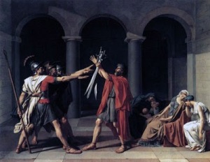
JR: I like the way figures, figurative images, especially on a large scale, include the viewer. Or rather predict the viewer perspectivally and/or compositionally in the way they are structured. It’s the way History painting works, for example, David’s Oath of the Horatii. The viewer is kind of positioned or articulated as witness. The other thing that interests me is the way in which in the human figure might be used to act out or perform ideas. In this case there is a perverse relationship between the idea and poses of the figures, that is whether these poses are the result of ‘free-will’ or whether they are fixed as narrative or compositional elements within a wider ‘philosophical context.’ Bit like your drawings: are the figures acting/moving/performing or are they trapped and restricted by a pattern you impose?

MB: Right, I ask myself the same question all the time! It always reminds me of Han Solo being frozen and “Relieved” into that wall. And the free will vs. trapped/restricted figures does also extend to and through the viewers. When you compose a life-size mural, you are trying to foretell the motion of a viewer’s eyes and maybe even attempt a hierarchy of images for the viewer to sequence.
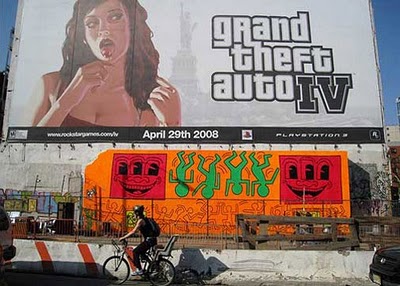
You have exerted great effort in generating “lifelike,” “realistic” images (we know how tricky those terms are, but let’s use them just for convenience). Even though they are surreal, hallucinatory, or implausible, the laws of physics still apply. The unicorn could be a token symbol of this relation: it doesn’t exist, but it seems as if it could, and it isn’t even difficult to envision. As you work, do you wonder whether “realism” and “plausibility” affect a viewer’s response to the imagery? Does more information deprive the viewer of agency? Does less information enable a viewer to apprehend the imagery and add something to it? I guess I’m asking what would happen if one of your murals shared a gallery with a Keith Haring mural.

JR: Yes, I guess the argument goes that realism is a kind of a problem technically (regardless of whether or not it is also a problem philosophically/theoretically etc) because the illusion can never be strong enough. Whereas a less realistic approach (‘less information’ as you put it) leaves space for the viewer to see their own picture and to include themselves in. There’s something in that, although whatever style or format of represention is used from Haring to Pollock and/or wherever/however this is presented (gallery, grafitti, internet, formal, casual, less information, more information etc) we are always already structured/articulated/positioned as viewers by the images.
That is not to suggest there isn’t room for slipping/transformation/re-performance. The type of realism I use (if realism is the right word) is very conventional and stereotyped – tied to the restrictions of 3d modelling which uses conventional preset perspective – modelled on a cinematic camera format. I’m interested in the spacing/spatialising effect this articulates – as the space of the cliche/stereotype/archetype. And the potential of spectacle.
In this respect, technically, I don’t really know what I’m doing, anyway (technically). I use all the cheapest and easiest 3d software and adapt pre-existing 3d models I find on the web (or buy cheaply from 3d sites). And then spend a long time (too long) in Photoshop working on details in hundereds of layers.
All the figures are kind of found objects, or cliches (found objects are a kind of cliche – yes?), including the unicorn for instance. What interests me in this is the way ‘sense’ (in a Deleuzian sense) slips across the surface of these type of objects. So technically/formally 3d objects are wrapped or surfaced by photographs.
![]()
With digital imagery and in particular 3d imagery – not only is there a move away from the indexicality of the photograph (Barthes etc) – as a kind of proof of something that ‘happened’. But increasingly imagery (photographic imagery) is used to wrap around 3d forms or models within 3D files, as a kind of surface affect or texture – of ‘shininess’, ‘skin-ness’, ‘wet-ness’, ‘rock-ness’, ‘grass-ness’, ‘face-ness’ and so on – thats how you select which photos to use.
Admittedly, this effect is contained and frozen within a larger image in whatever format it is finally outputted. But the way these wrapped images slip ‘like meaning’ or ideas across the surface of forms or models is reminiscent of Deleuze’s description of the way ‘sense’ slips across the surface of events, passions and forms. The structure is similar in my mind. It’s an effect you see a lot in cinema – think spaghetti westerns – Once Upon a Time in the West or The Good the Bad and the Ugly – the characters abstracted from American Western films operate as archetypes/dead forms – when you watch Clint Eastwood you are watching sense slipping across the surface of a found object. Very exciting/ecstatic as well.